
Color isn’t just a visual treat; it’s a powerful tool that can influence emotions, behavior, and even decisions. Imagine walking into a room painted in fiery red versus a calming blue. One screams “party time” while the other whispers “nap zone.” Understanding color theory isn’t just for artists and designers; it’s for anyone who wants to harness the magic of color in their everyday lives.
Overview of Color Theory
Color theory encompasses the principles and guidelines regarding the use of color in various applications. It connects colors to emotional influence, composition, and the visual experience.
Definition of Color Theory
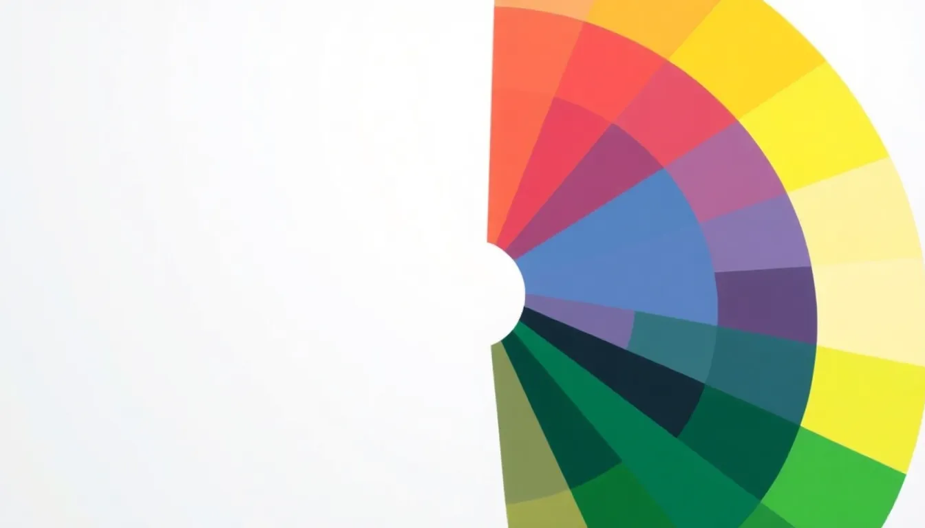
Color theory provides a framework to understand how colors interact and relate. It categorizes colors into primary colors, secondary colors, and tertiary colors. Primary colors include red, blue, and yellow. Secondary colors arise from mixing primary colors, such as green, orange, and purple. Tertiary colors emerge from combining primary and secondary colors. The color wheel visually represents these relationships, helping individuals to visualize color harmony and contrast.
Importance in Art and Design
Art and design heavily rely on color theory to create effective compositions. Color influences mood and conveys messages, affecting viewer perception. Artists utilize color to evoke particular emotions, while designers apply it to enhance brand identity and user experience. Color choices impact marketing materials, website designs, and interior spaces. By understanding color theory, creators make informed decisions that resonate with their audience and amplify their intended message.
Key Concepts in Color Theory
Color theory includes essential concepts that enhance understanding of color use. These concepts categorize colors and outline interactions to create visual harmony.
Primary Colors
Primary colors consist of red, blue, and yellow. These colors serve as the foundation for creating all other colors. They cannot be made by mixing other colors. Mixing primary colors results in secondary colors, allowing for a diverse color palette. Artists and designers rely on these colors to establish visual impact. Their fundamental nature highlights their importance in color theory.
Secondary Colors
Secondary colors emerge from mixing equal parts of two primary colors. For example, blending red and blue produces purple. Combining blue and yellow creates green, while red and yellow yield orange. These colors add depth to color palettes. They occupy a critical role in color theory by diversifying color options available for creative projects. Understanding secondary colors enriches color selection for both aesthetic and emotional considerations.
Tertiary Colors
Tertiary colors arise from mixing primary and secondary colors. For instance, combining red and orange results in red-orange. This category further expands the color spectrum, introducing shades like blue-green and yellow-orange. Tertiary colors bridge the gap between primary and secondary options, offering versatility in design. Their complexity enhances visual interest, allowing artists to convey more nuanced emotions and themes. Understanding these colors is essential for effective color application in any project.
Color Harmonies
Color harmonies represent combinations that create visually appealing designs. Understanding these harmonies enhances the effectiveness of color choices in various applications.
Complementary Colors
Complementary colors are pairs located directly across from each other on the color wheel. For example, red and green form a classic pair. These colors produce a high contrast that can draw attention and energize compositions. Using complementary colors can create visual tension, making designs dynamic and striking. This method helps emphasize key elements and evoke strong emotions in viewers.
Analogous Colors
Analogous colors sit next to each other on the color wheel. For instance, blue, blue-green, and green create a serene and harmonious effect. Designers often use analogous colors to establish a cohesive look while maintaining interest. This combination tends to be visually pleasing and soothing, making it effective for creating tranquil environments. Pairing neighboring colors enhances a design’s unity without overwhelming the audience.
Triadic Colors
Triadic colors consist of three colors evenly spaced around the color wheel. An example includes red, yellow, and blue. This scheme offers a balanced yet vibrant aesthetic. Designers benefit from using triadic colors as they provide diversity while maintaining harmony. The strategic arrangement of these colors helps create energetic and engaging designs, appealing to a wide range of audiences.
Psychological Impact of Color
Colors influence emotions and perceptions. They evoke specific feelings that can shape behavior and decision-making.
Color and Emotion
Colors and emotions are closely linked. Red often stimulates excitement and urgency, making it ideal for attention-grabbing contexts. Blue, conversely, promotes calm and tranquility, suitable for spaces aimed at relaxation. Yellow tends to inspire happiness and optimism, creating a cheerful atmosphere. Green can signify growth and renewal, beneficial for health-related themes. Understanding these associations helps individuals select colors that convey desired emotional messages effectively.
Color in Branding
Brands leverage color psychology strategically. Companies often choose colors that reflect their values and appeal to target audiences. For instance, tech brands typically utilize blue to convey trust and reliability, appealing to professionals seeking security. Fast-food chains often use red and yellow to stimulate appetite and create a sense of urgency. Luxury brands may opt for black or gold, evoking sophistication and exclusivity. Consistent use of color enhances brand recognition and fosters an emotional connection with consumers.
Practical Applications of Color Theory
Color theory plays a significant role in various fields. It offers practical insights that enhance visual communication and aesthetics.
In Graphic Design
Graphic designers rely on color theory to create compelling visuals. Colors impact user engagement, guiding attention and evoking specific feelings. Designers often use complementary colors for striking contrasts, making elements stand out. Analogous colors lend a harmonious look, enabling a seamless flow between images and text. Additionally, knowing psychological associations helps designers select colors that resonate with target audiences. For instance, blue is frequently used in tech branding to inspire trust, while vibrant colors attract attention in marketing materials. By strategically applying color theory, designers elevate their work and ensure effective communication.
In Interior Design
Interior designers utilize color theory to craft inviting spaces. Color choices can significantly influence mood and perception within a room. Soft blues and greens create tranquil environments, promoting relaxation, while rich reds or oranges stimulate energy and warmth. Designers often apply the principle of color harmonies to maintain balance throughout spaces. Using a monochromatic scheme ensures cohesion, while contrasting colors can highlight architectural features. The strategic placement of colors affects the perceived size of a room, making it feel spacious or intimate. Understanding these principles enables designers to enhance the functionality and atmosphere of various environments.
Understanding color theory is crucial for anyone looking to harness the power of color in their lives. Its principles not only guide artistic expression but also enhance communication and emotional resonance. By recognizing how colors interact and influence perception, individuals can make informed choices that elevate their designs and environments.
Whether in branding, graphic design, or interior spaces, the strategic use of color can create impactful experiences. Embracing the insights of color theory allows for a deeper connection with audiences and a more profound expression of ideas. Ultimately, color is more than just a visual element; it’s a powerful tool for conveying meaning and evoking emotions.